Summer has been kind of crazy and busy. I continue to take tons of pictures (although 99% of them are on my iphone), I have just been slacking in selecting, editing, cropping, printing, and assembling them into each weekly layout. So over the last 2 weeks, I have busted butt, and I am (practically) caught up.
This project has always been so enjoyable for me. The process, just as much as the end result. This summer was brutal, and I had this constant nagging feeling about how far behind I was. I DO NOT LIKE that feeling!
So, since the process I explained above seemed very overwhelming and time consuming, I decided to put these layouts together digitally. What I mean is, I used 4x6 and 3x4 canvases, and just printed them as photos so I could insert them right in the traditional Style A pages. I create these in PSE (photoshop elements), and use a variety of different digital kits/elements/etc. I will do my best to link up to the sources.
Ok...here we go!
Full layout.
Left Side
Right Side
This week I used many elements from Michelle Underwood's Dwell in possibilities Kit. Often, I will create a blank 4x6 document, add a background paper, add photo, then maybe some journaling and embellishments. Drop shadows help to make it look a little more 3 dimensional and not so "digital". Also, lots of photos collages/frames/designs are created right on my iphone.
It was 4th of july, so I used lots of red/white/blue elements. I found a free 4th of July digi kit, and for the life of me, can't remember where I found it, or who it is by. Everything you see on this page is from that kit...sorry.???
Lots of text right on the pictures so I had more room to add photos. I am pretty much obsessed with the Insta Lovin' Kits by Rhonna Designs. If you follow my Instagram feed, you will notice lots of the same patterns/designs. They can be used on your phone, and as png files/brushes. She has awesome tutorials and info on her blog.
Front side of Insert. I used Becky Higgins Design G page protector. All 4th of July pics!
Back of Design G. We hit the beach a lot too!

Right side .
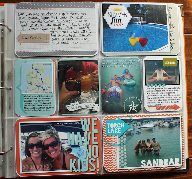
Fully Layout. This week, most of my digital elements are from Persnickity Prints free digi kit- Sun and Sea. I loved the blues, yellow, and coral. The rest was from the Clementine kit. Very bright and cheery!
I think I used a little bit of Rhonna's designs everywhere. Again, I was looking to move fast, and these brushes are super fun and easy to use. I typed up my journaling and printed right onto the cards from my core kit. Also, I used one of Ali Edwards Hello Life Boxes (story of our days) over one of the clementine patterned papers.
Right side. I put together a map of all the stops we made before heading out of town for the weekend. I love when people include little details like maps/text messages, etc, and I'm trying to throw those in here and there. Also got my new kindle this week, so I cut the front off the packaging and punched some holes to fit in the binder.


4 comments:
Great job getting caught up. I like how you do all the digital stuff and then print and just slip in. I still haven't done anything with my picture except get them up on my blog. Someday!
I ♥ ♥ ♥ your pages!
They have so many fun elements, but don't look crowded or messy.
Also, way to get caught up so fast! :)
without even looking at your layouts closely I was impressed with all the work you must've done ... after looking at them, I'm even more impressed!
Glad you got caught up!! I just love your PL layouts they are some of my favorites to look at:) I am so far behind. I hope one day I will be caught up, like one day before December 31!!!
Post a Comment